the journey continues…
I am always learning. This blog is a place to embrace that and showcase my process, curiosity and desire to improve and grow my skillset.
Do it the nice way
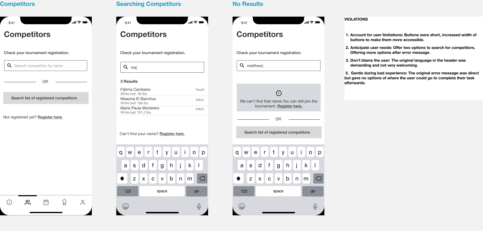
I designed a friendlier search experience by separating personal registration checks from competitor browsing, with filters to support each use case.
Descriptive writing
I focused on using clear language to explain deductive and inductive methods in a portfolio project introducing a new concept.
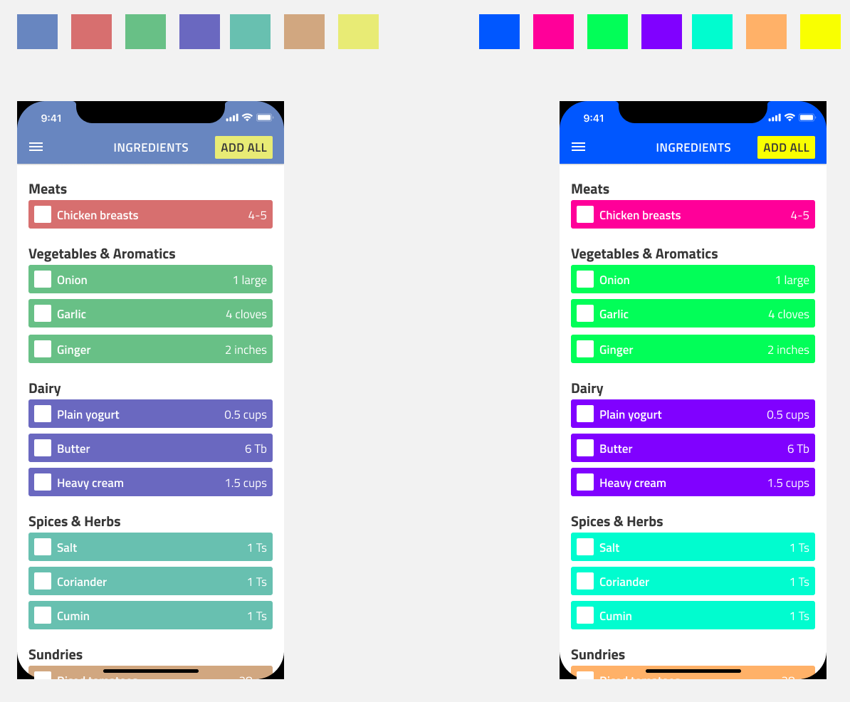
Brand based palettes
I experimented with muted and vibrant color palettes, noting that the vibrant one would need toning down for better accessibility with white text.
Laws of Locality
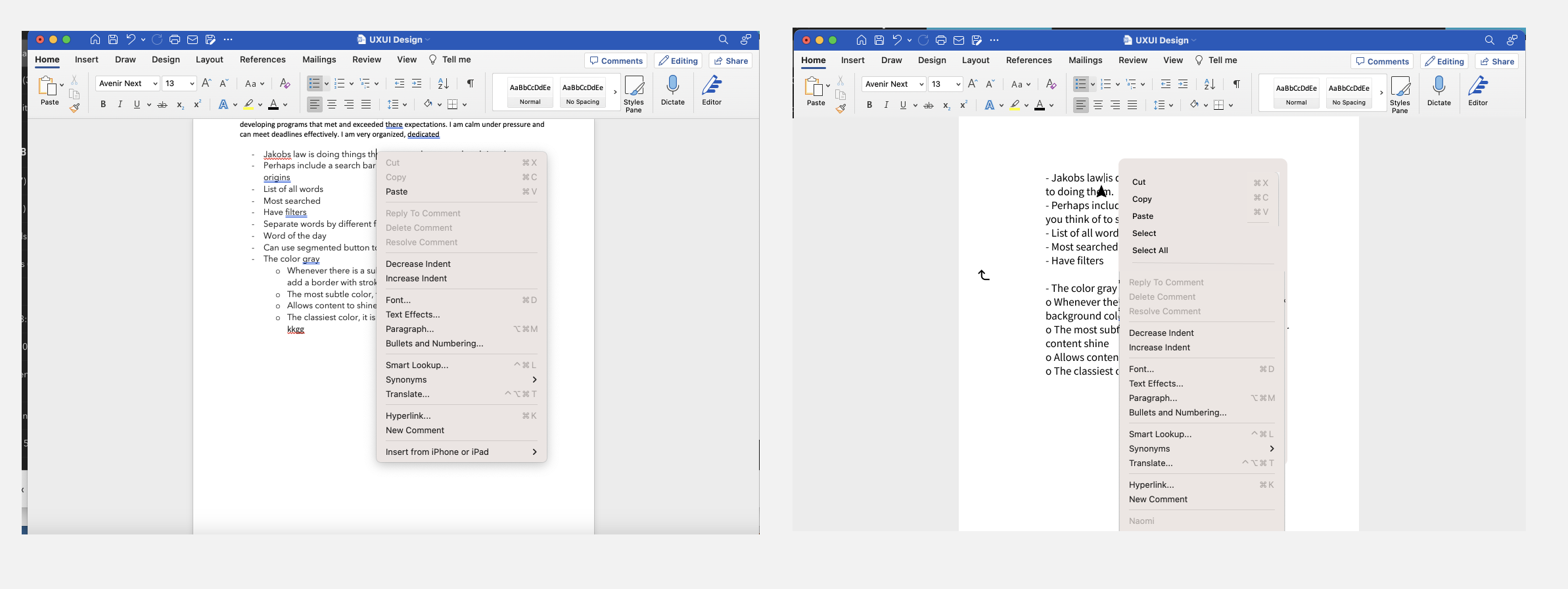
I tackled a common Microsoft Word frustration by adding a quick “Select” and “Select All” option when right-clicking a word, making the feature more accessible within the document.

Adjustments
I played around with adding color to the search bar at first but settled on keeping it white since I'd think search would be the main element I'd use on the page and it pops more in white.
Jakob’s Law
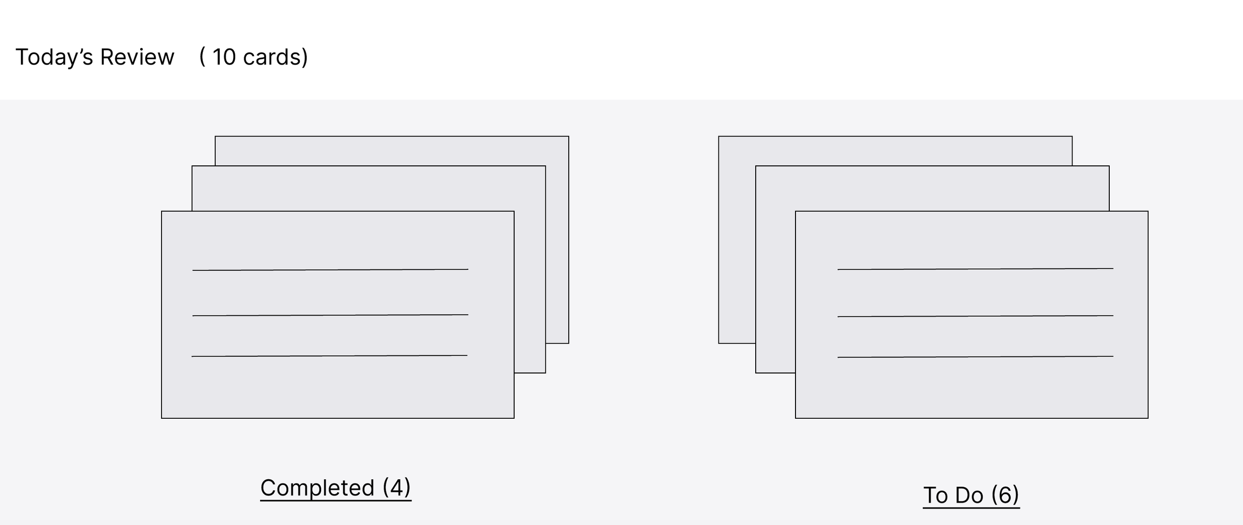
I applied Jakob’s Law by researching similar apps and designing familiar interactions, like flipping a card to reveal an answer, to match real-world expectations and reduce friction.
The color gray
I like a really simple to do list for personal tasks where I can check off and feel accomplished. I created a design in that vein. I used gray with a hint of color to achieve this.
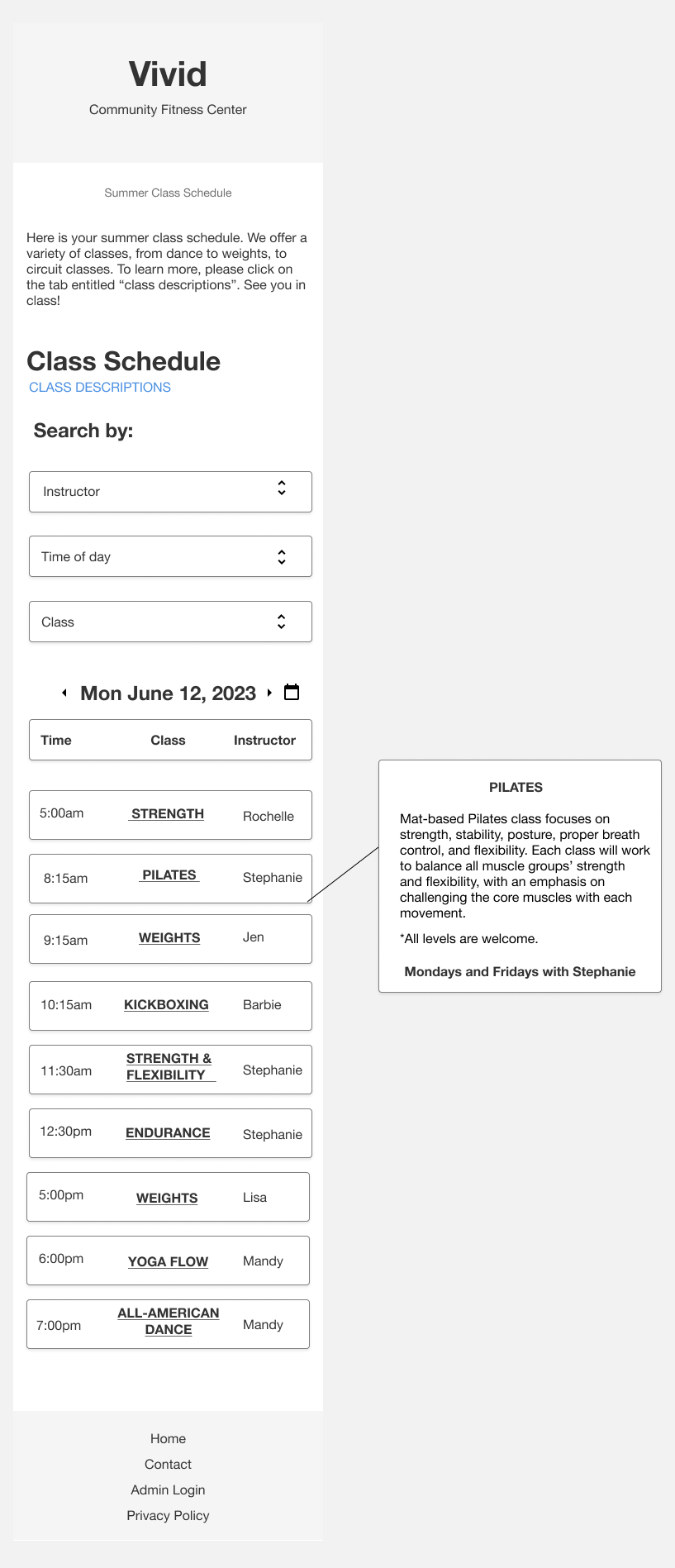
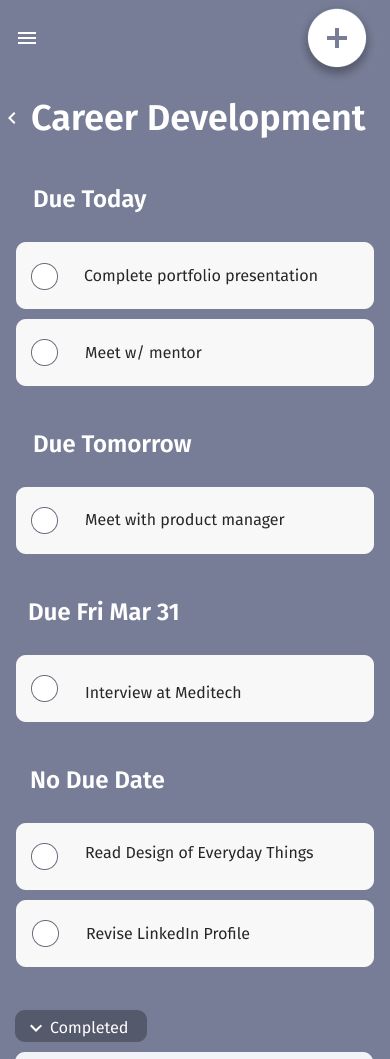
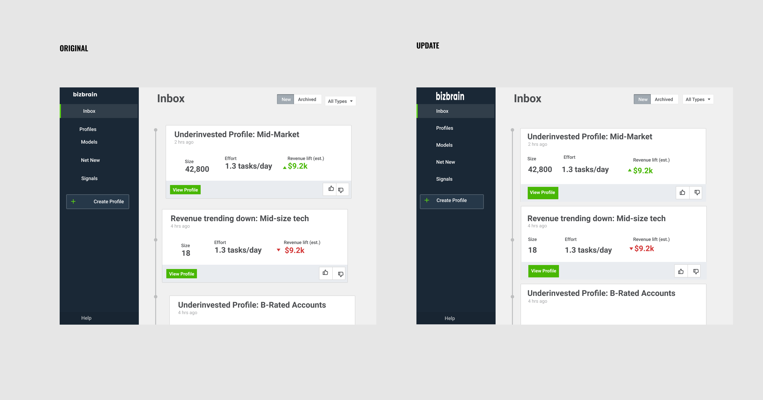
Show what’s actionable
I streamlined class browsing by enabling targeted search, adding a date picker, and making class links clearly clickable for faster, more intuitive access.
Interaction Design
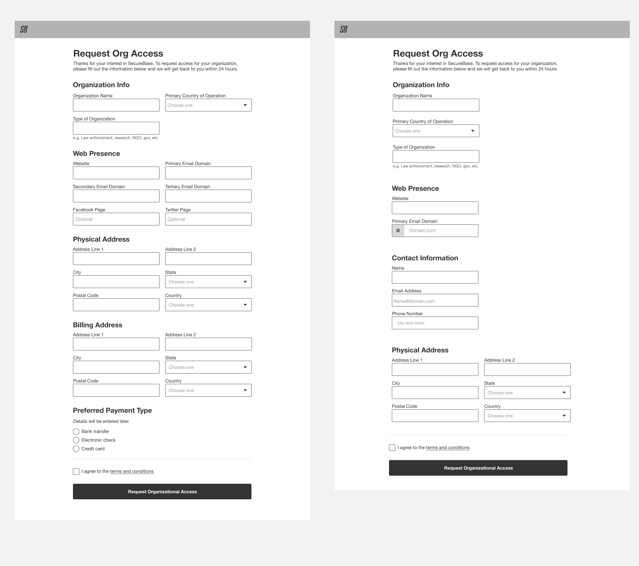
To reduce user effort, I removed unnecessary fields, added contact info for confirmation, and simplified the form based on what’s essential and what users actually need to complete their task.
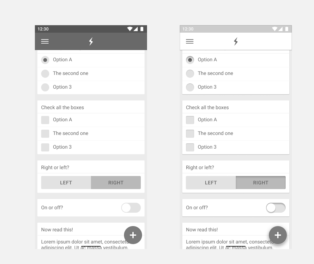
Lighting and Shadows
I used subtle shadows on cards and inactive elements, keeping in mind that light comes from above, while making active components like toggles and buttons stand out.
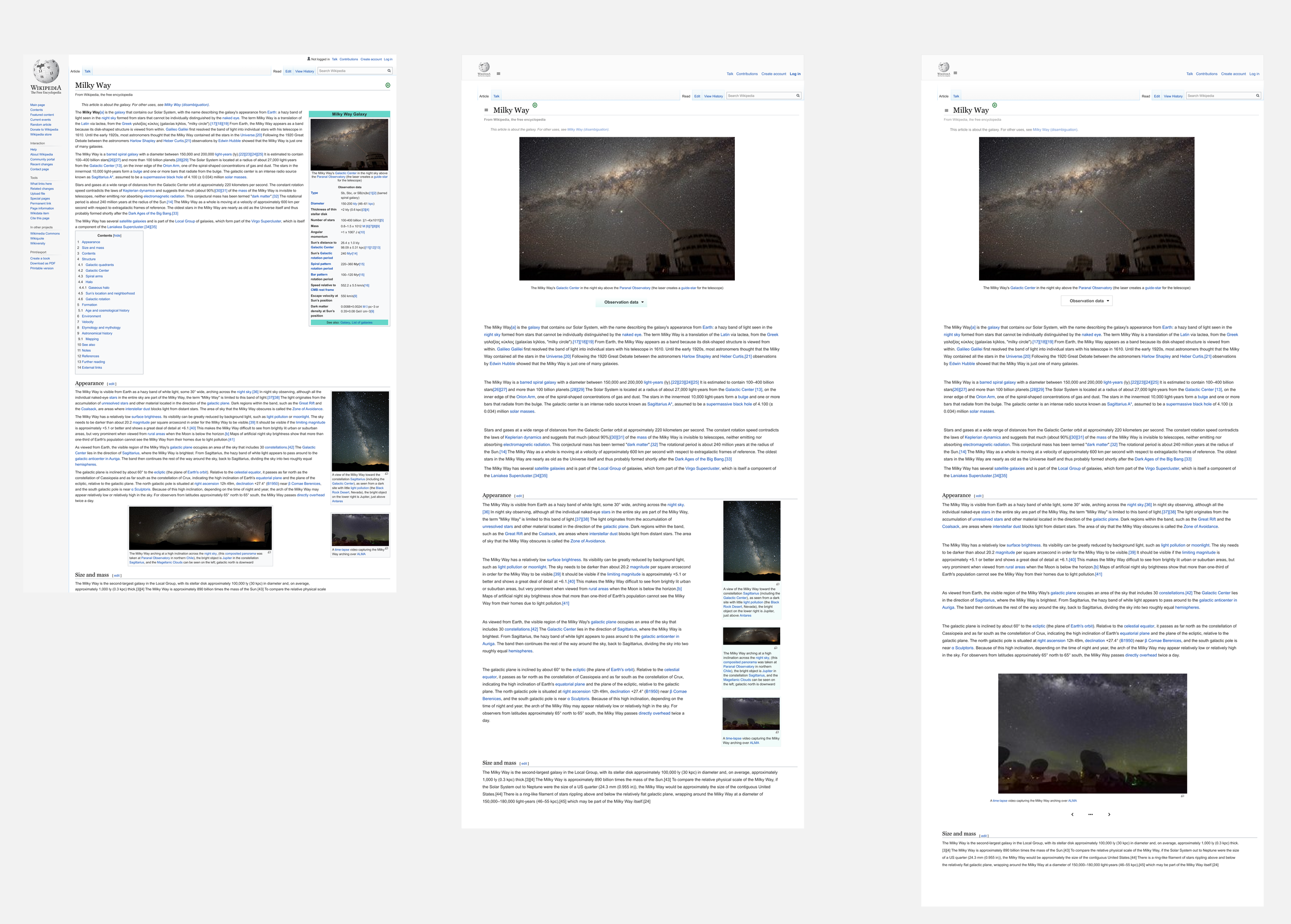
Simplicity
I simplified the Wikipedia page by refining alignment, spacing, and consistency, while preserving valuable images and making observation data accessible without overwhelming the layout.
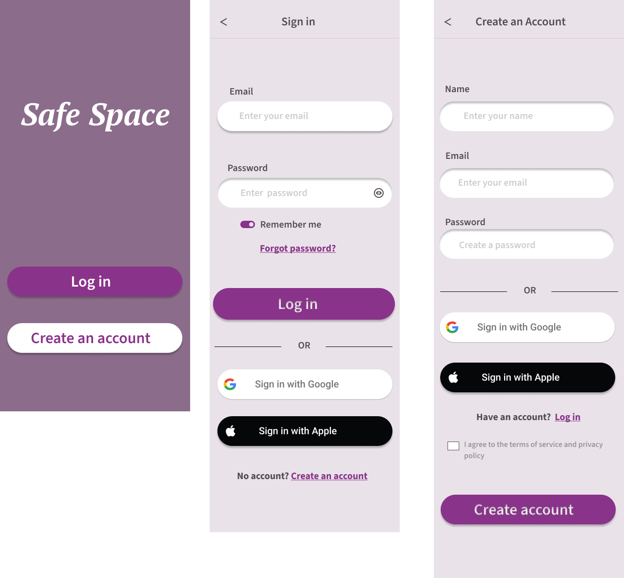
Consistency
I focused on visual consistency across the sign-in page to signal cohesion and ensure a clear, intuitive user experience.
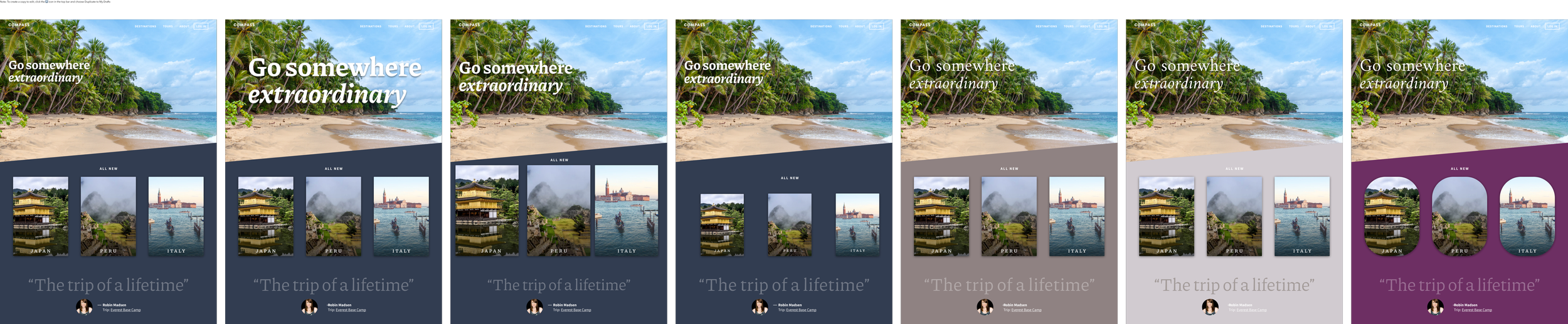
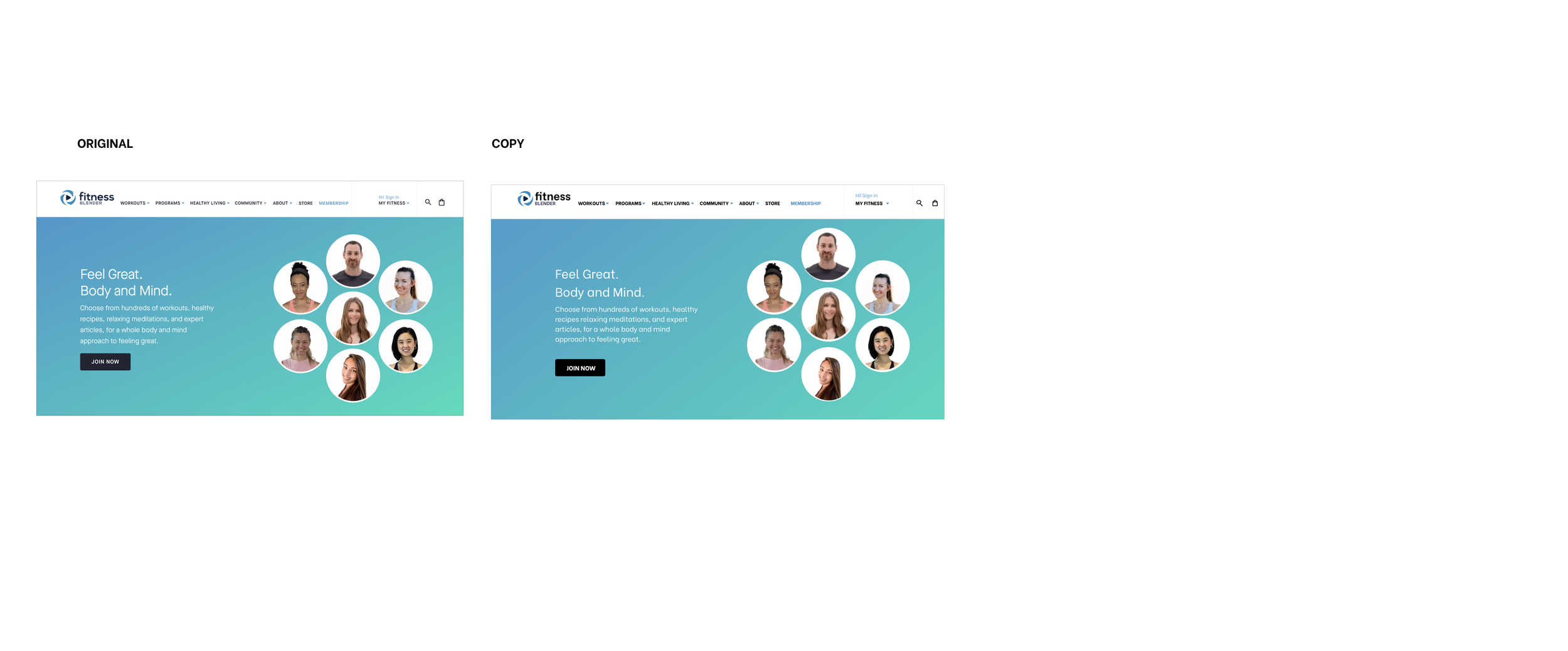
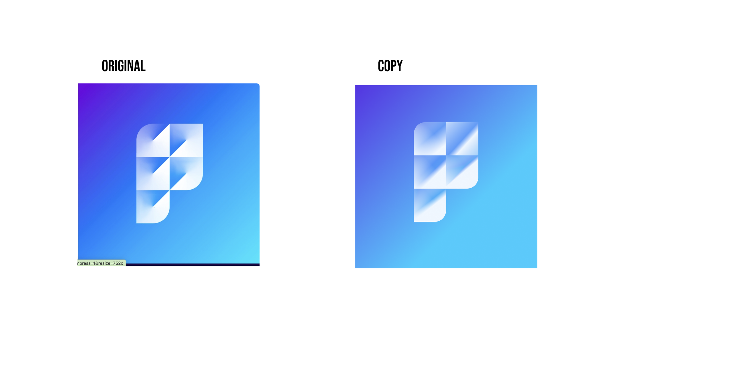
More Copy Work
I used a similar free font, practiced removing image backgrounds, and created custom icons to build my skills beyond relying on plug-ins.
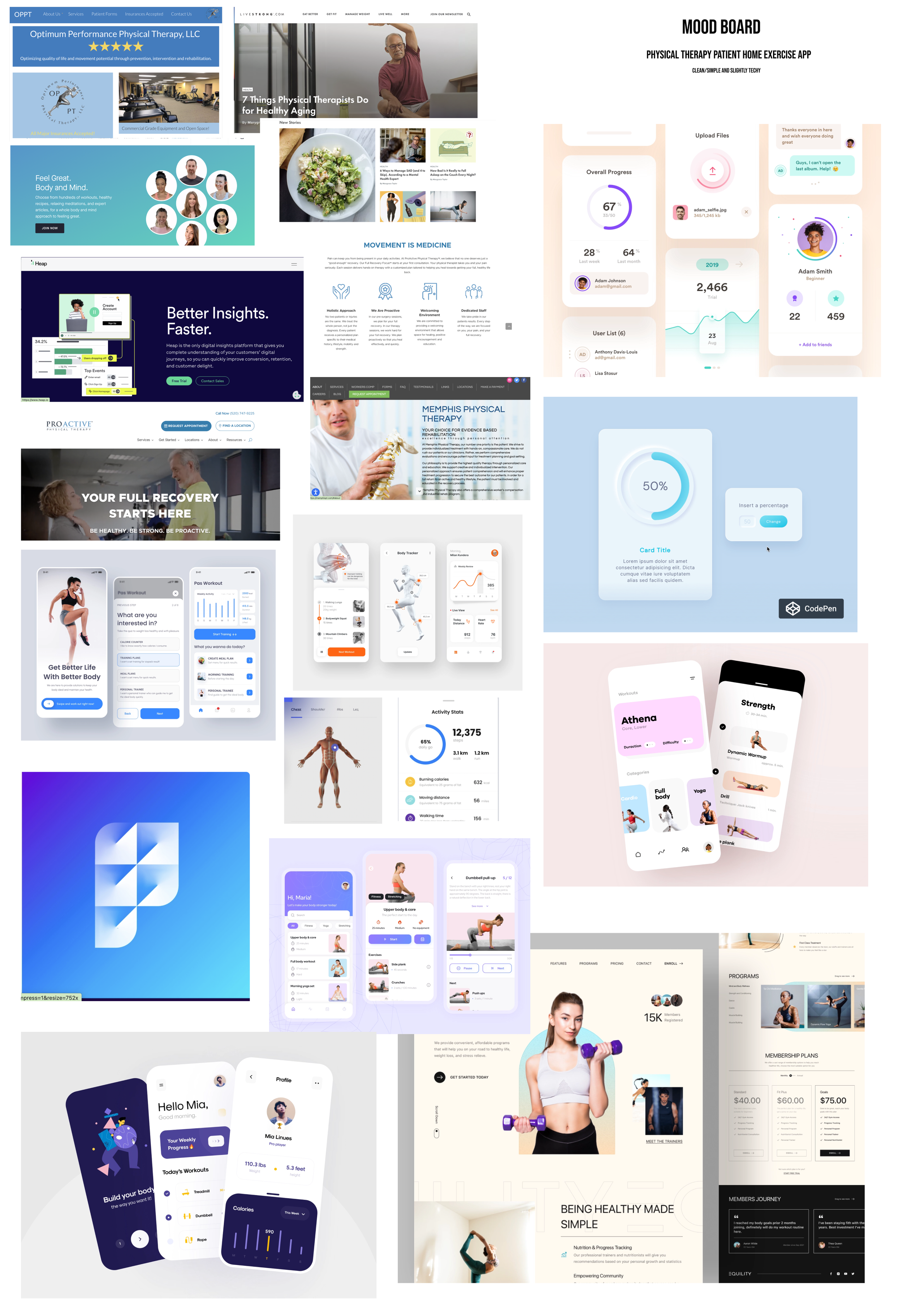
Mood Board
This mood board captures the clean, simple, and slightly techy look I aimed for in the physical therapy app, balancing trustworthiness with an engaging, approachable UI.
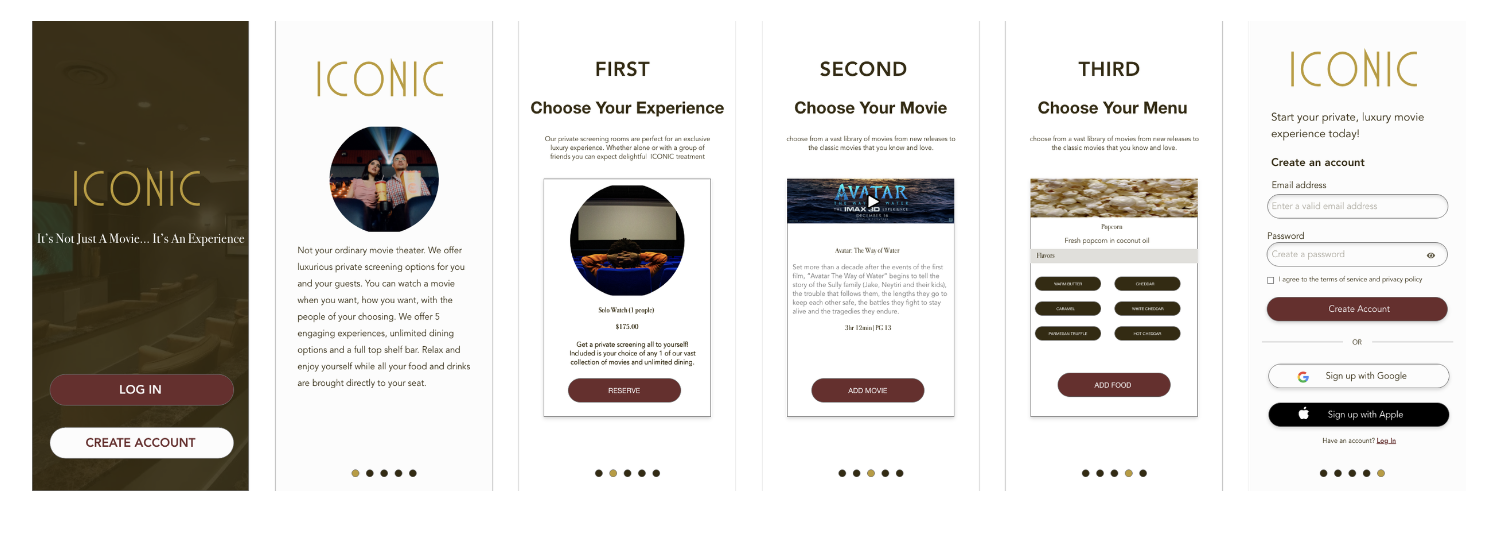
Gut Instinct
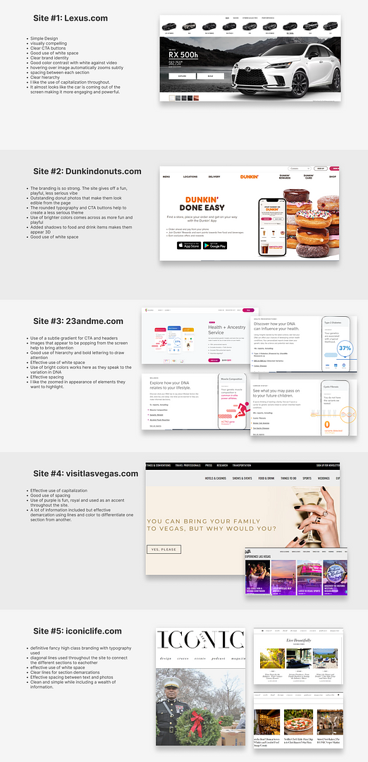
I tried to look for some variation in websites that I like. I found I'm drawn to sites with a lot of white space and clear branding and demarcations from section to section.