the journey continues…
I am always learning. This blog is a place to embrace that and showcase my process, curiosity and desire to improve and grow my skillset.


Designing Multi-State Screens
How do you design for an interface that’s always changing? For this RSS feed app challenge, I explored multi-state screens to create a smoother and more intuitive user experience. Turns out, accounting for all the “what ifs” is where real design thinking begins.

Charts & Data Visualization
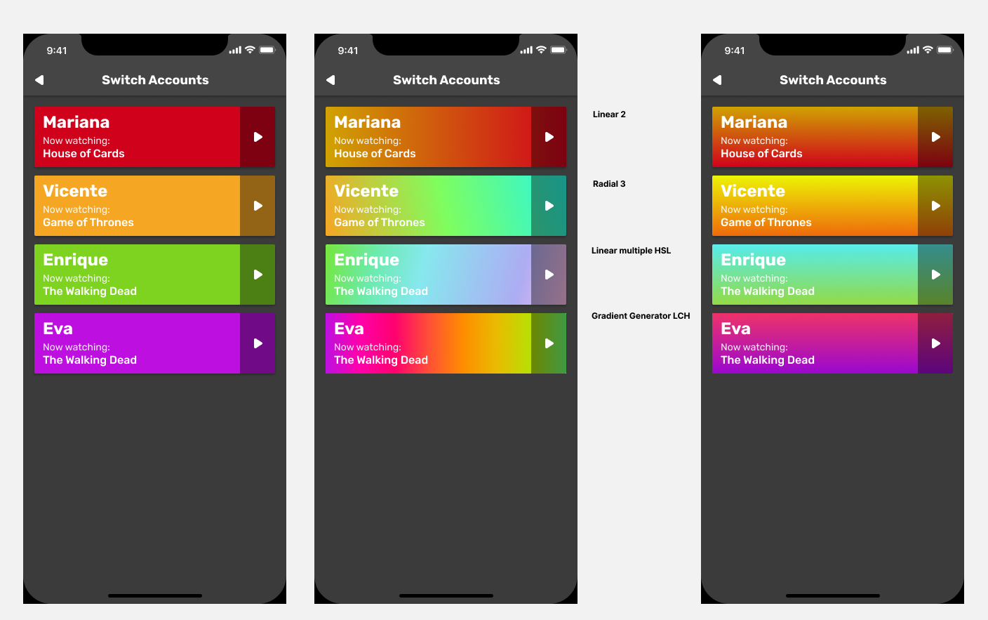
Data visualization turns complex info into clear stories. I used charts to share insights and found simple colors work best.

User Flows
I researched dog walker apps and used user stories to design a flow that meets the needs of both walkers and owners.


Responsive Design
To practice Responsive Design I began with mobile designs and moved to larger screens, making adjustments for layout and spacing to find the best look.

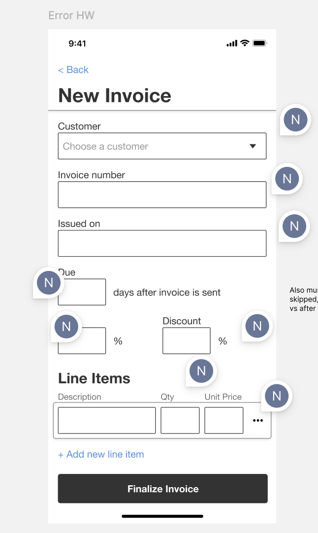
Component Library
I practiced building a consistent component library while learning how complex managing different states can be.

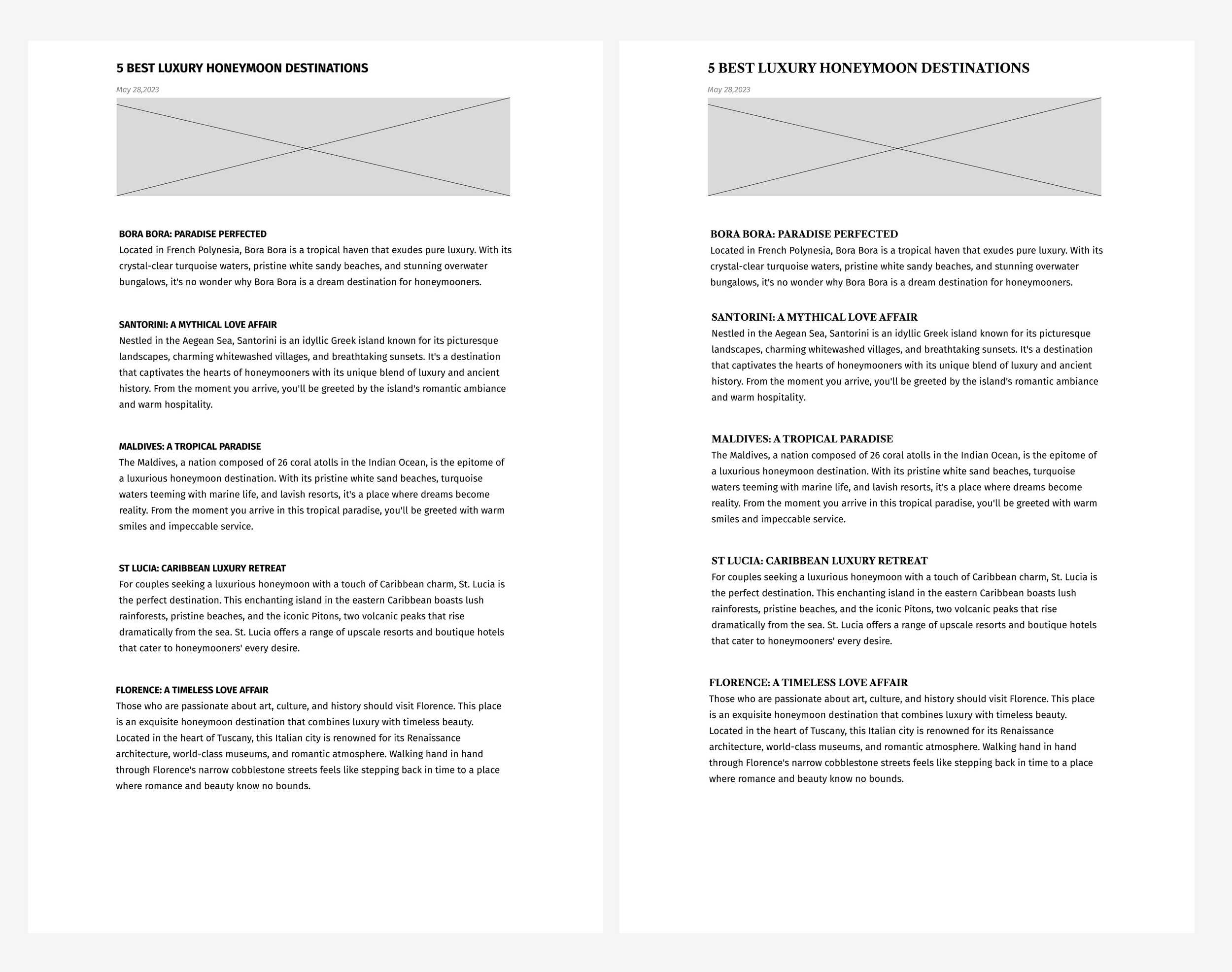
Styling Text III
I practiced text styling to create a luxury, masculine, and classic brand feel using drop caps, indents, and formatted quotes.
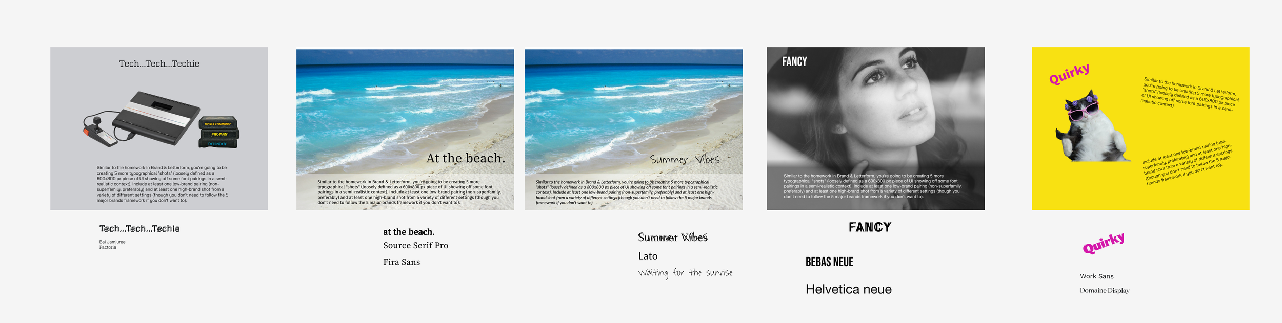
Pairing Fonts
Ever wonder how the right font can instantly make something feel more relaxed, playful, or even summery? I explored this by pairing type with beachy visuals to bring the vibe to life.
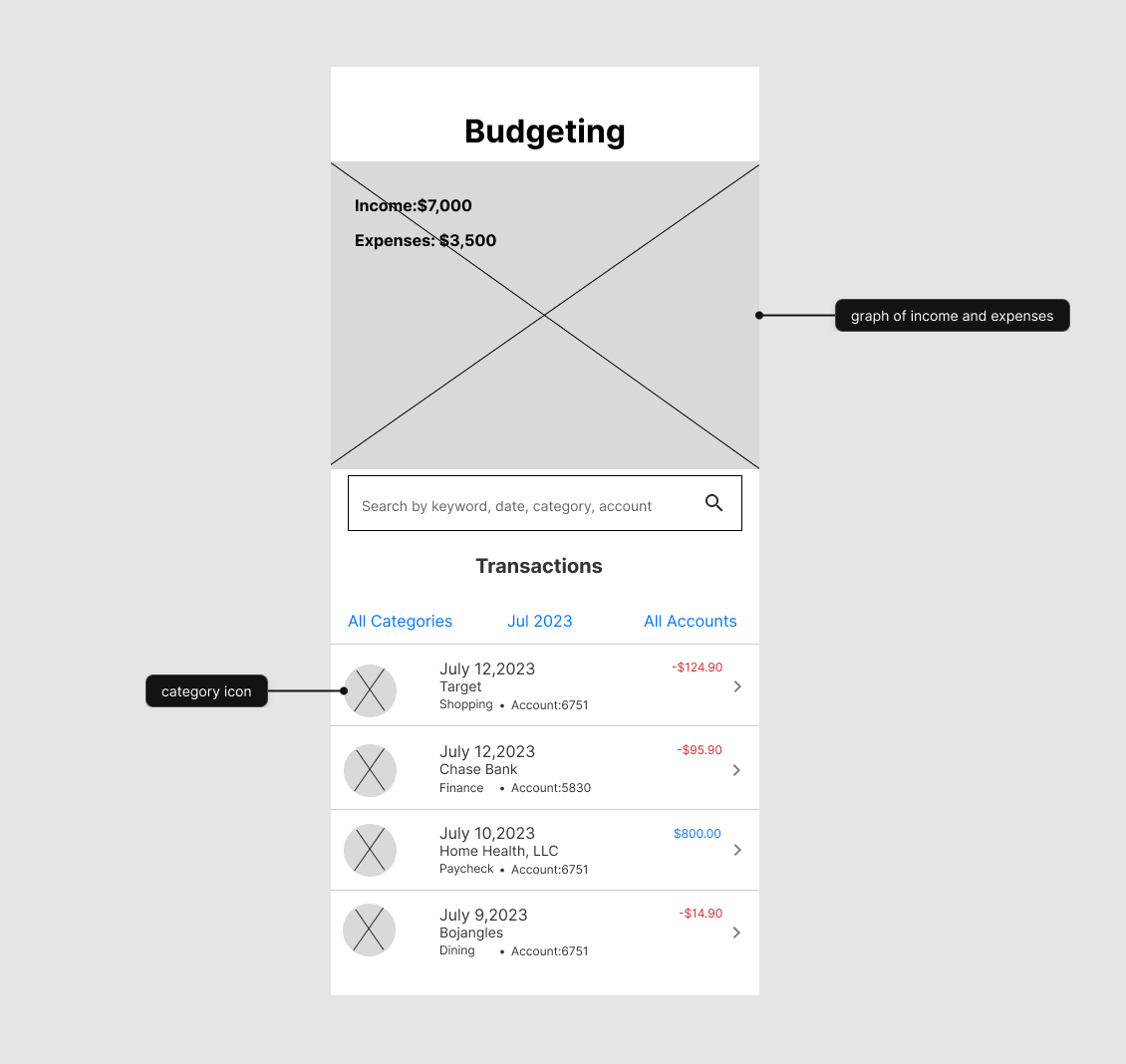
Lists & tables
I designed a financial mobile app focused on key features like filtering, search, and expandable transaction details within limited screen space.
Styling text …again
I explored emphasis through typography using Grotesk for a playful feel and Helvetica with size, color, and opacity changes, while experimenting with price tags to highlight key info.
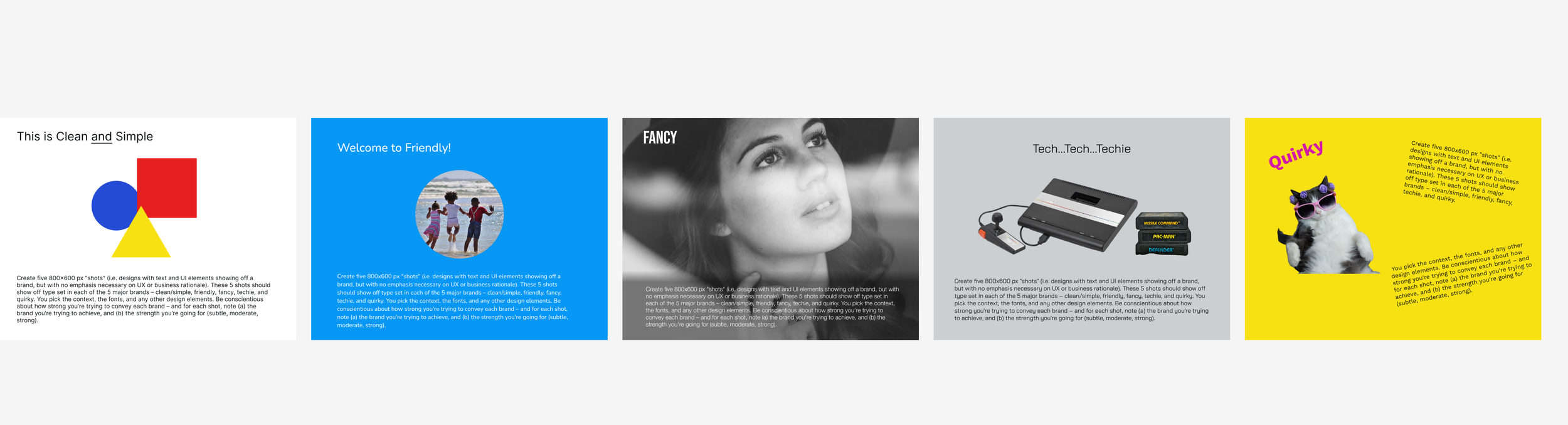
Brand & letterform
The text we use should match the brand we are trying to achieve. Here I used text to display clean and simple, fancy, techie, and quirky brands.
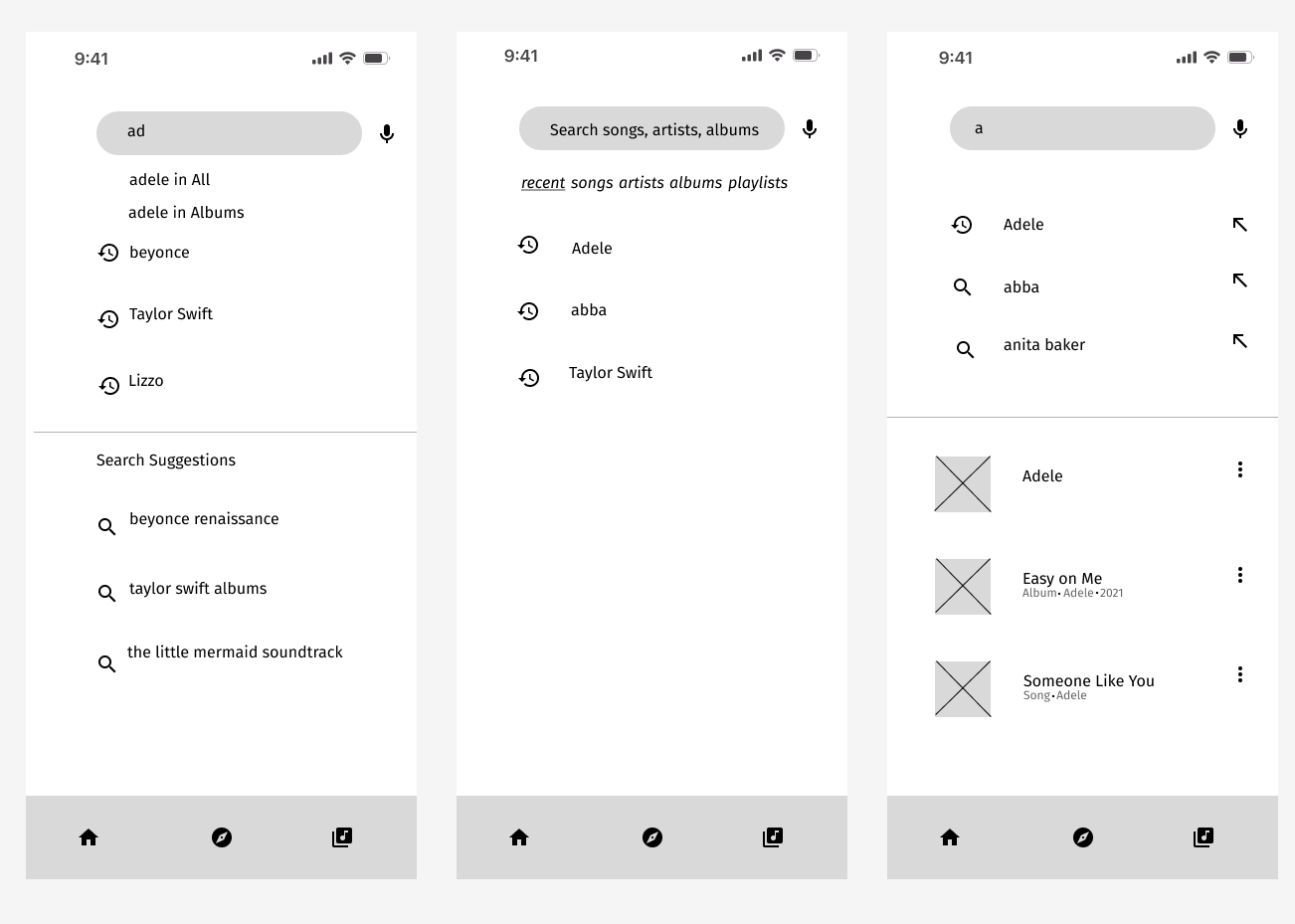
Search & filter
I explored multitype search using autocomplete and recent searches to improve efficiency, with a focus on minimizing steps and returning relevant music results quickly.
Styling Text
I explored type choices for a luxury brand, landing on Fira Sans with bold, capitalized headings to maintain a clean and trustworthy look.
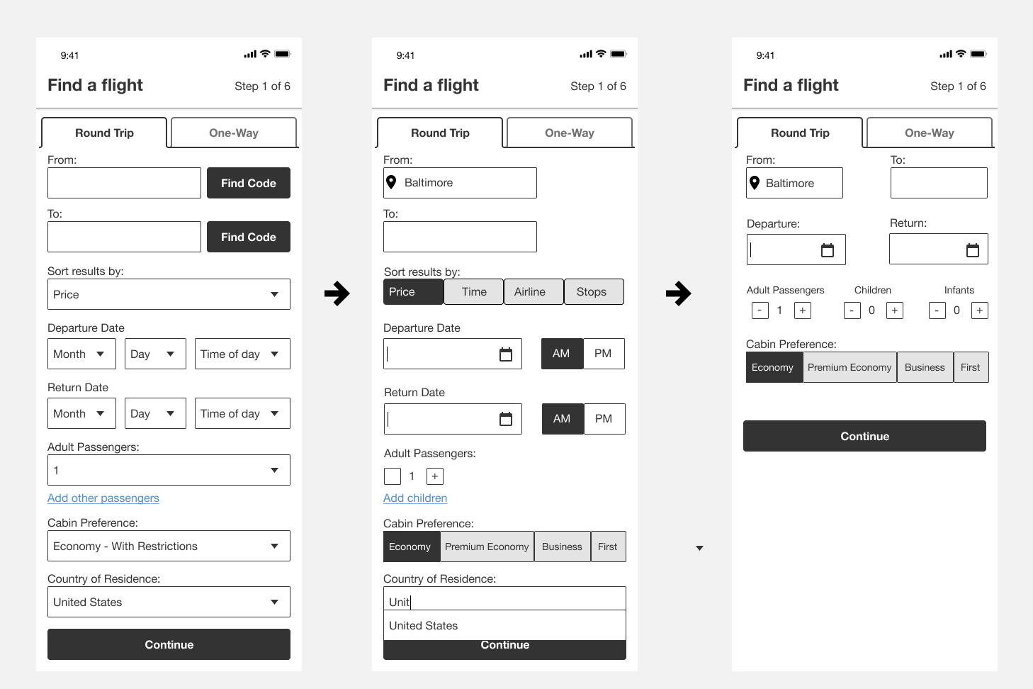
Selection Controls
I optimized selection controls and removed unnecessary inputs to streamline the flight search experience, focusing on clarity, relevant filters, and smarter airport and passenger options.
Navigation
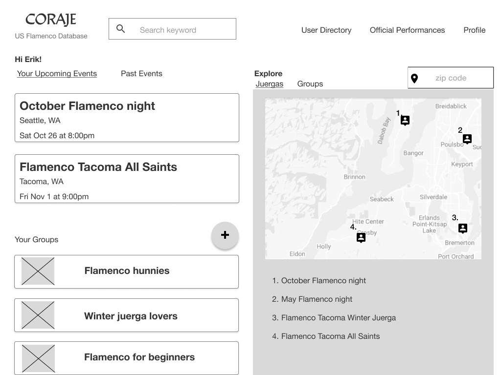
I redesigned the site as a dashboard focused on discovering jam sessions, combining a map and list view on the homepage for easy access, and added features like event tracking and renamed sections for clarity.
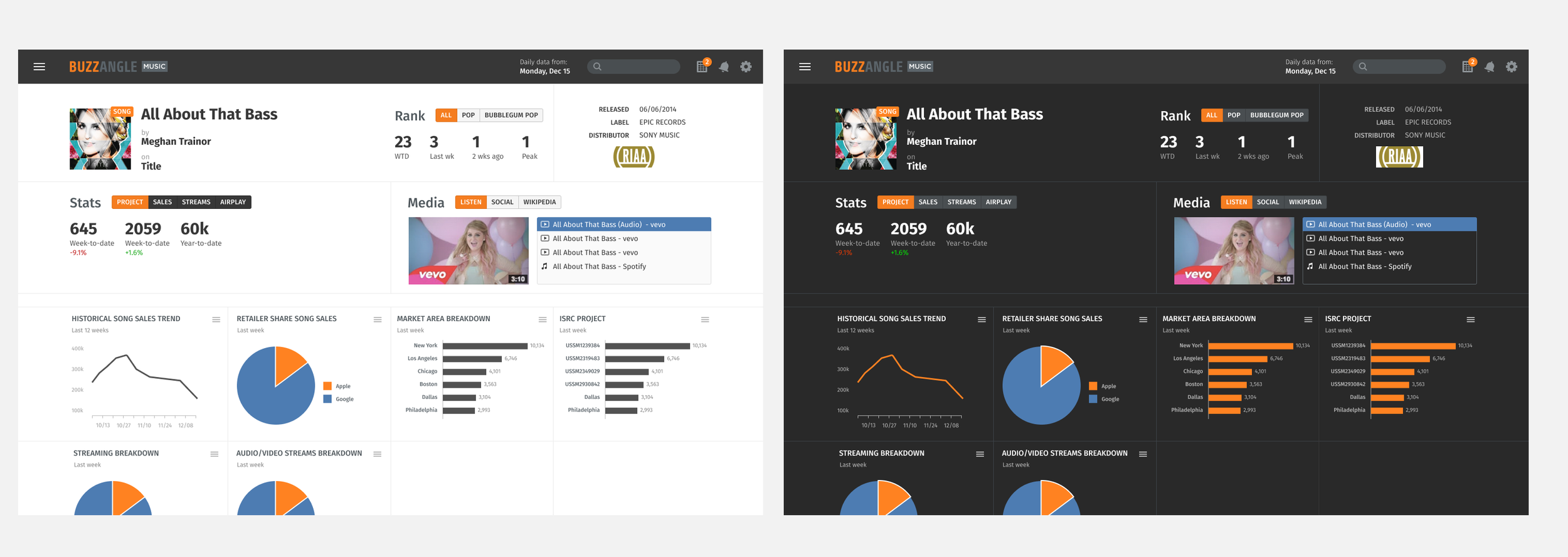
Dark interface
Here I got to play around with creating a dark interface. I achieved the look by darkening background colors and modifying highlight colors.