
BACKGROUND
Finding a mental health provider can be a daunting experience.
As someone with a background in public health I believe it is important to address the health of the whole individual, this means that mental health is just as important to our well-being as our physical health.
As my friends and I reached our 30’s, we found there were multiple stressors pulling at us; careers, marriages, children, finances, aging parents, add to that a pandemic and the continued strain of racial injustice and there was a need to find better ways to cope.
Receiving care from a qualified mental health provider would be a great way to develop the tools needed to stay grounded and find fulfillment in an ever changing world, however, we found it wasn’t an easy process. Finding a therapist who gets you and your life experience can be daunting.
With this project I sought to find a way to make finding a competent and relatable mental health provider easier, particularly for members of the black community who are underrepresented in receiving mental health care.
PROBLEM
Black People are less likely to receive the mental health care they need.
Blacks are just as likely as any other ethnicity to live with mental illness yet they are less likely to receive mental health care and when they do they are less likely to encounter diverse, relatable and culturally competent providers.
SOLUTION
Personalized service and a relatable provider are most important.
An app and a website that will assist members of the black community in finding a culturally competent mental health provider, who is relatable and meets their individualized needs.


USER RESEARCH: SECONDARY RESEARCH
Black individuals are being underserved in the mental health space.
I began by completing background research on mental health and the black community.

USER RESEARCH: PRIMARY RESEARCH
Relatability, respect, understanding and compatibility are the foundation for finding a provider.
I completed user interviews with 6 black participants, 4 females and 2 males, ranging from 18-45 years old.
I expected that most of the interviewees would best be able to identify with a black provider, that wasn’t always the case. The majority of participants indicated that gender, relatability, and understanding were most important regardless of the race of the provider.
It was important for participants to feel respected and heard by their provider.
To observe themes and gather insights from my interviews I created an empathy map for each participant.
One insight I gathered from my research is that the majority of users would compare finding a compatible therapist to dating.
I kept the insights from my interviews in mind throughout the design process to ensure I was designing with actual users in mind.


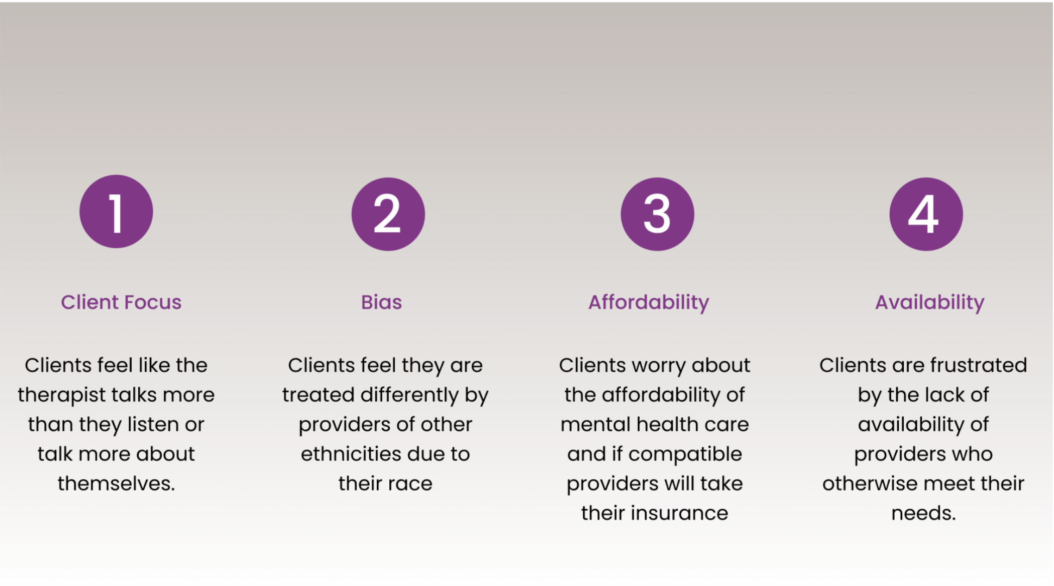
PAIN POINTS
From the insights gathered FOCUS, BIAS, AFFORDABILITY AND AVAILABILITY WERE MAJOR PAIN POINTS.
PERSONAS
I utilized personas to focus on the 2 groups of target users I found during user interviews.


COMPETITIVE AUDIT
The gap in the online model for finding a health provider is personal connection.
I completed a competitive audit on 3 direct competitors and 2 indirect competitors. I found that it is important to have a way to search for providers on your own and while matching services for mental health providers exists, none of them are personalized by real people, they are all generated through artificial intelligence. I saw an opportunity.


IDEATION: SKETCHES AND PAPER WIREFRAMES
Staying open minded during the ideation process was important.
I began the ideation process with How Might We statements to brainstorm.
I applied What If statements to each how might we statement to gather multiple design solutions.
I let my imagination run wild at this point, with no judgement to keep the process open.
Lastly, I started sketching to bring some of the ideas to life.


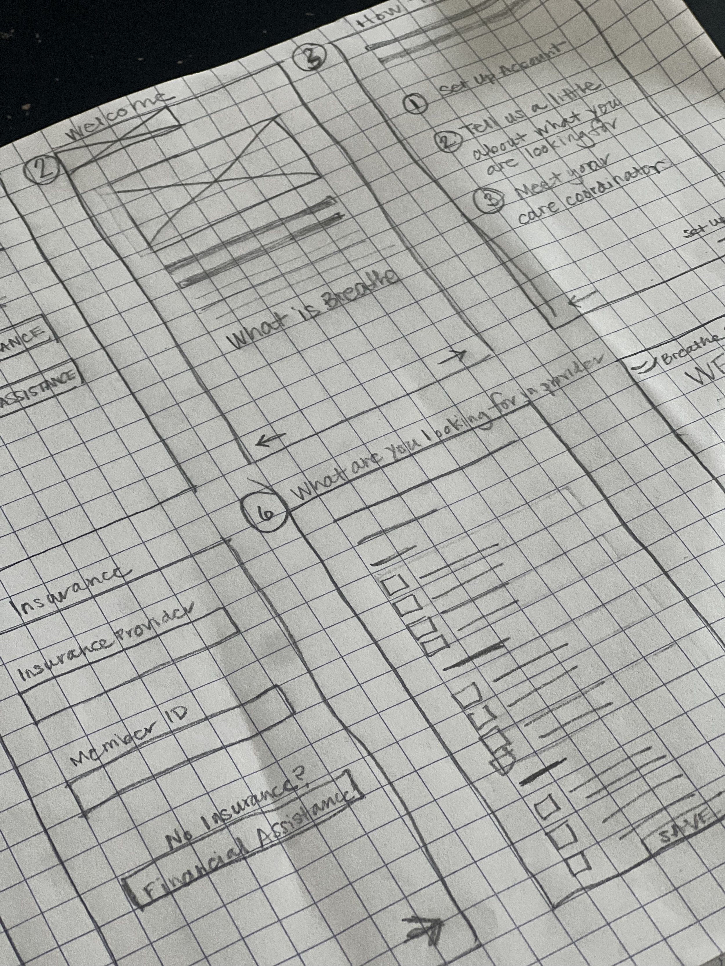
LOW FIDELITY PROTOTYPE
I designed a low-fidelity prototype to showcase the user flow.
Creating an account and choosing a mental health care provider based on personalized recommendations from a care coordinator.

DIGITAL WIREFRAMES
I created digital wireframes based on my paper sketches and ideation.
The focus of the designs were creating a personalized concierge experience for finding a mental health provider.

USABILITY STUDY
I conducted unmoderated usability studies with 8 participants, 3 male and 5 female.
Seeking to determine if users could create an account on the app, schedule with their coordinator and choose a therapist.
The focus of the designs were creating a personalized concierge experience for finding a mental health provider.
The theme that came out of the low fidelity usability studies was clarity. Users don’t want to think about what an element could mean, they want it to be obvious.

The theme I noted from the high fidelity usability study was personalization. Users want to make sure their individualized needs are addressed in an easy to navigate way.

MOCKUPS
Based on the insights from the usability studies I added additional information for clarity.
A note was added under the personalized therapist choices highlighting that they were matched to them by their care coordinator after their conversation. I also added each therapist’s speciality.
BEFORE USABILITY STUDIES

BEFORE USABILITY STUDY

AFTER USABILITY STUDY

MOCKUPS OF MAIN USER FLOW

AFTER USABILITY STUDIES

I wanted the role of the care coordinator to be clear to users so I added details to the care coordinator page to provide that clarity.
HIGH FIDELITY PROTOTYPE
Details were added to the high fidelity prototype to clarify the purpose of the app and website.
The differentiation between a care coordinator and a therapist, and specific filters to address user needs were added to the prototype.
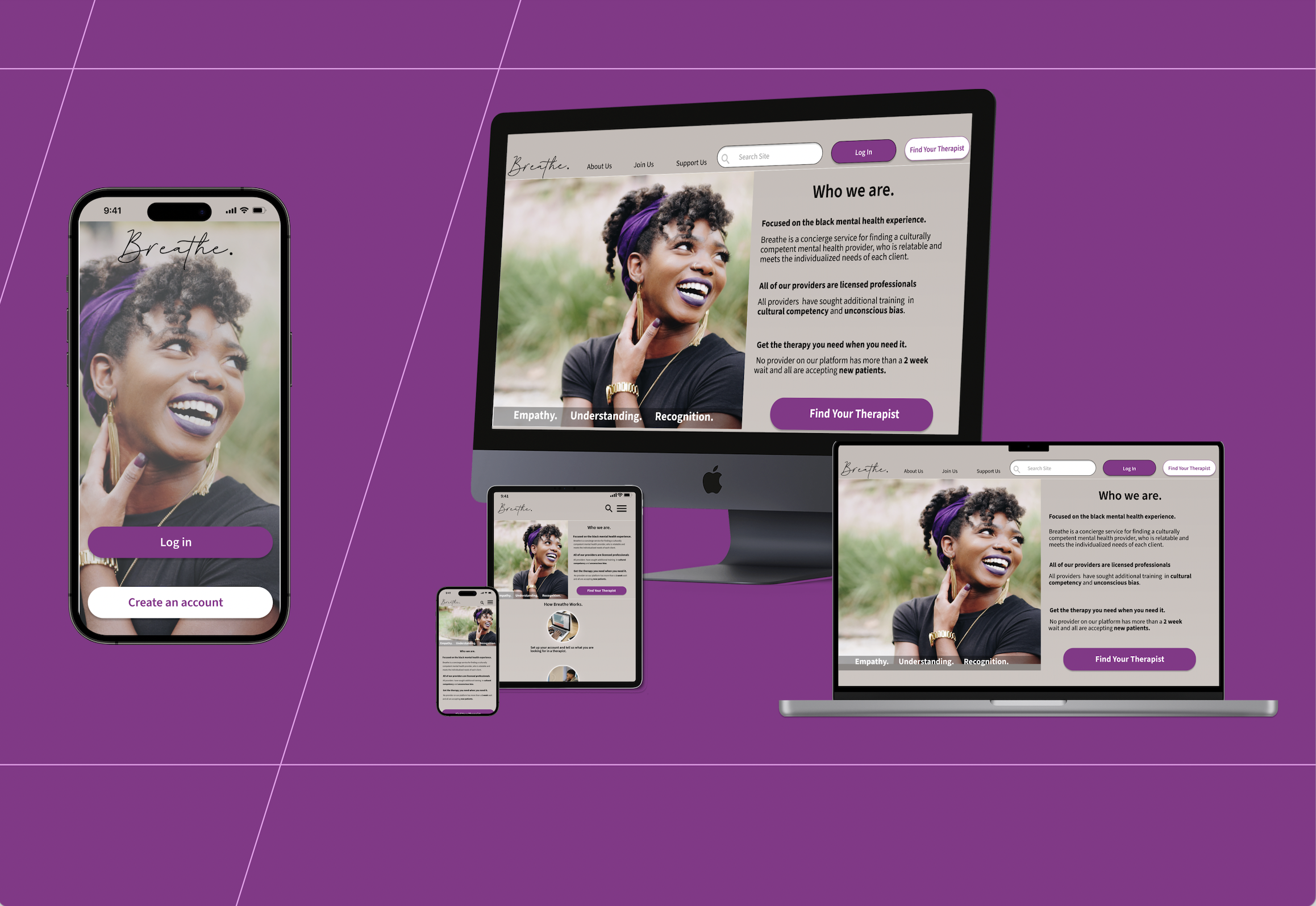
BREATHE HIGH FIDELITY PROTOTYPE
STYLE GUIDE
Style Guide
I wanted the colors and typography to match the calm, warm welcoming brand of Breathe.

ACCESSIBILITY
The design supports accessibility with screen reader labels, display customization, and therapist filters for diverse needs.

RESPONSIVE DESIGN
For this project I created a website to go along with the mobile app.
To get started I produced two site maps. One for users who have not registered on the site and the other for those registered users that have logged in.

RESPONSIVE DESIGN
I created different screen sizes to ensure accessibility across devices.
I designed for mobile, tablet, and desktop screen sizes. I made sure to include all of the relevant elements in each design and used a progressive enhancement approach to scale up from the smallest design to the largest design.


TAKE AWAYS
Impact
“This is so easy to use and uncomplicated, why doesn’t this service actually exist.”
Users shared that they thought having a human vs a computer (AI) helping to navigate the mental health care system and find a therapist would make the process less intimidating. They like the idea of being able to quickly find a therapist who meets their individuals needs and understands their cultural perspective.
what i learned
Through this project I learned how important content and descriptive language is. Users need to understand how a site is different than others to get buy in on a new product.
NEXT STEPS
Next steps include improving app visibility, enhancing the site for fundraising, and expanding inclusive provider training resources.
