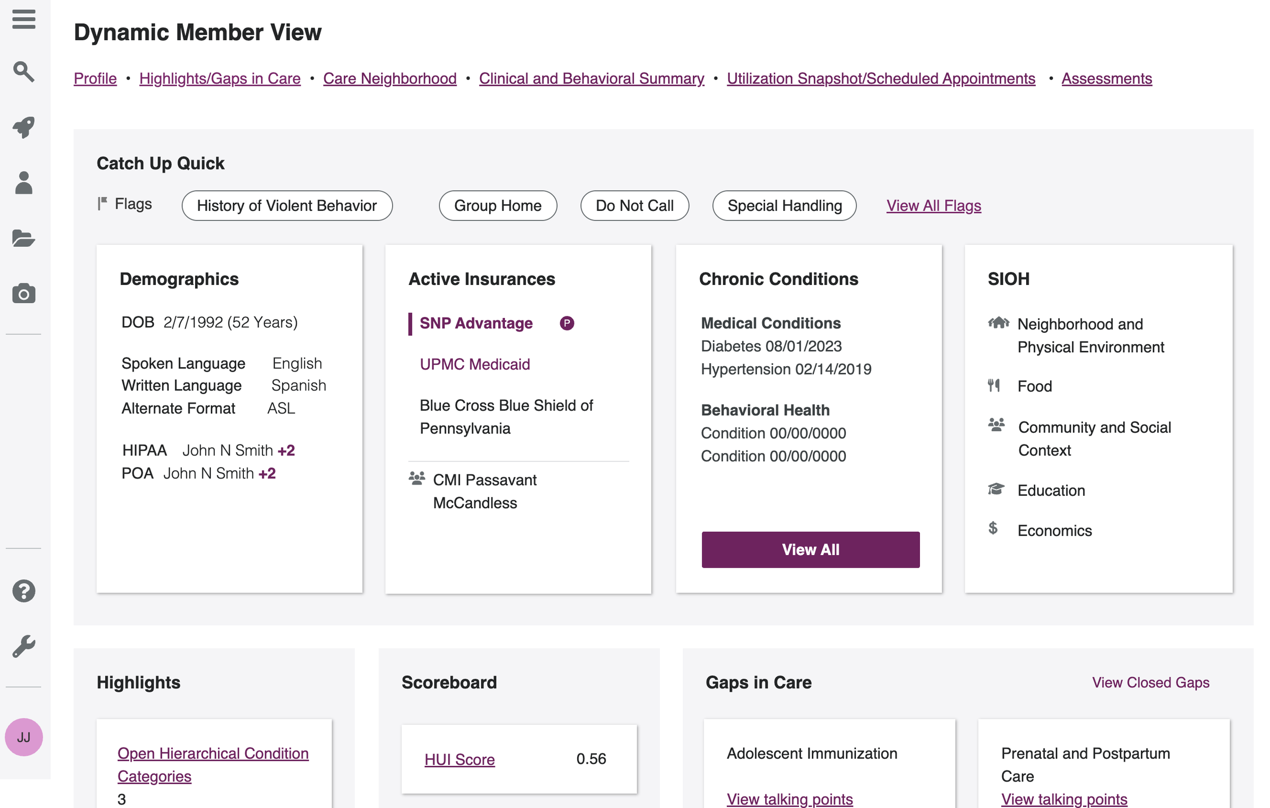
BACKGROUND
A clinical application should be optimized to streamline information access and improve user experience.
The Dynamic Member View application is designed to help clinicians efficiently gather critical patient information before engaging with them. This project focused on understanding user behavior and assessing the ease of use of the application, aiming to identify pain points and navigation challenges to guide improvements in future product features.
SCOPE
Led end-to-end usability research to deliver actionable insights and inform design decisions.
Designed and conducted usability studies, led the analysis and synthesis of findings, presented actionable recommendations to stakeholders and the design team.
RESEARCH QUESTION & GOAL
Users may not be utilizing the Dynamic Member View (DMV) as intended.
Question: How are users finding what they need in DMV and is the process efficient?
Goal: Uncover key pain points in using DMV to research patients prior to engagement.
RESEARCH PLAN
Conducted a moderated virtual usability study with diverse healthcare professionals to evaluate the user experience.
Participants: 4 leaders/supervisors
3 care managers
Varied application experience
.Duration: 60 minutes
Environment: Virtual on Microsoft Teams
Type: Moderated usability study
Timeline: Nov-Dec 2023
Moderated usability studies were conducted to evaluate how participants navigate and find patient data.
To evaluate usability in real-world conditions, we conducted 7 moderated sessions via Microsoft Teams with participants across roles and experience levels. Our approach prioritized authenticity, safety, and insight:
Participant diversity: Included clinicians with varying levels of experience to reflect real-world workflows and perspectives.
Scenario-based prototypes: UX and visual designers collaborated to build interactive prototypes grounded in realistic care tasks.
Live sessions, HIPAA-compliant: Conducted in a secure test environment with no recordings to protect privacy.
Hands-on interaction: Participants were given screen control to navigate the interface freely while performing typical tasks, like finding and interpreting patient data.
Facilitated guidance: A UX team member moderated each session, offering support without leading the participant.
Deep documentation: Three note-takers captured quotes, behaviors, and decision-making patterns — enabling rich synthesis and identification of usability issues.
Key focus: Observed how users handled uncertainty, interpreted interface structure, and interacted with complex patient information
USABILITY STUDY
ANALYSIS & SYNTHESIS
From the data, patterns and themes were discovered and insights were captured.
KEY FINDINGS
Users faced navigation challenges, unclear content, and undefined terminology across multiple sections, impacting ease of use and data interpretation.
Care Neighborhood: Users were uncertain about the content and experienced difficulties with excessive scrolling.
Home Services: Truncated text and hover-dependent details made it difficult to determine available services.
Clinical and Behavioral Health Summary : Navigation and readability challenges due to table design, excessive scrolling, and unclear column resizing. Trends in lab data were difficult to identify.
Demographics: Users had trouble locating this section.
Utilization Snapshot: Users found it hard to interpret changes due to unclear badges and symbols (e.g., `/`).
Terminology: Terms like "highlights" and abbreviations like "SIOH" were not clear to users.
RECOMMENDATIONS
Recommendations aimed to improve navigation, clarity, and usability with better layouts, reduced scrolling, and clear terminology.
🏘️ Care Neighborhood
• Clarify section purpose with subtle descriptions or hover tooltips
• Use card-based layouts (horizontal or vertical) to reduce scroll fatigue📊 Utilization Snapshot
• Add an intuitive “close” or “back to home” interaction
• Replace vague badges with clear indicators (e.g. “New,” “Updated”)📁 CBHS Table Design
• Introduce expandable sections to limit scrolling
• Visually separate labs, tests, and screenings
• Use color or arrows to highlight out-of-range values
• Offer column resizing with a subtle hover control🏡 Home Services
• Integrate services as a dedicated table within CBHS for better visibility and hierarchy👤 Demographics
• Refine layout for better scan-ability and accessibility in mid-fidelity🧾 General Terminology
• Clarify language within the interface (e.g., “Highlights,” “SIOH”) via tooltips or info icons
IMPACT & REFLECTION
Findings inspired a redesign and stakeholder involvement was key to buy in.
Impact: These findings led to a reimagining of the layout of DMV to better accommodate efficient research so that clinicians could spend more time engaging with patients.
Reflection: I learned just how essential it is to include stakeholders along every step of the research process. If they see how participants interact with the application and see their pain points firsthand, they are more likely to buy into recommendations as a result of the research.


